How to choose the best booth location on a conference floor
Compare corner and inline booths, likely attendee routes, stage noise, entrances, traffic anchors, and location premiums before choosing a space.
For most small exhibitors, the best booth location is visible from more than one useful approach, gives the right visitors room to stop, and stays workable during the event’s busiest periods. A corner booth can help, but it is not automatically better than an inline booth on a route used by the people you want to meet.
Do not choose from the floor plan by counting nearby landmarks alone. A space beside the main stage may deliver a rush before a session and then make conversation difficult, while a quieter cross-aisle between relevant sessions and coffee can produce fewer passersby but more useful stops.
This guide is for a small team comparing ordinary inline and corner spaces. It does not attempt to optimize a large island exhibit, a hospitality suite, or a booth whose schedule is already filled with appointments.
Decide what the location must do
Write down one primary job before looking at available spaces. If every benefit is important, a conspicuous corner will tend to win the discussion even when it does not serve the event goal.
For a small B2B booth, that job is usually one of the options below. Choose one as primary even if the event also serves a secondary purpose.
- Create awareness among attendees who do not know the company
- Start qualified conversations with a defined kind of visitor
- Run product demonstrations for people discovered on the floor
- Provide a meeting point for pre-booked appointments
- Reach attendees connected to one track, profession, or product category
This guide optimizes for qualified conversations. That makes audience fit, stopping room, and conversation conditions more important than the largest possible traffic count.
Turn the goal into a short location statement before comparing booth numbers. For example: “We need operations leaders leaving the growth-stage sessions to notice us, understand the message from the aisle, and stop for a five-minute conversation.”
Eliminate spaces with hidden problems first
A promising position is not worth scoring until the basic space works. Ask the organizer about anything the sales floor plan does not show, and treat an uncertain answer as an open risk rather than an assurance that the area will be clear.
Check each candidate for the problems below. One unresolved obstruction or operating constraint can matter more than an attractive position on the map.
- Columns, pillars, railings, or signs that interrupt the sightline
- Queues that may form in front of the booth
- Speakers, stages, or demonstrations that may prevent normal conversation
- Service doors, waste stations, catering operations, or exhibitor storage
- Emergency exits and clearances that affect the usable layout
- Booth-height, wall, hanging-sign, or line-of-sight restrictions
- Floor ports and the route for power, internet, or other ordered utilities
- A neighboring booth whose walls, screens, sound, or crowds could dominate the area
The organizer’s current exhibitor manual takes priority over general booth advice. The IAEE floor-plan workbook describes an inline booth as having neighboring exhibitors on both sides and one aisle-facing side, while a corner booth sits at the end of that row and is exposed to two intersecting aisles. Actual dimensions, wall rules, packages, and permitted layouts vary by show, which is why the Freeman overview of booth types also directs exhibitors back to the organizer’s options and rules.
Compare the position, not the label
“Corner,” “main aisle,” and “near the entrance” describe features, not outcomes. Use the comparison below to identify what must be checked rather than treating any row as a universal ranking.
| Position | Possible advantage | Main risk | Stronger fit when |
|---|---|---|---|
| Corner booth | Visible and open from two aisles | Extra exposure is wasted by a one-sided layout; a premium may apply | The message and staff positions work from both approaches |
| Inline booth | Usually simpler to lay out and may cost less | Only one open side makes it easier to pass unnoticed | The aisle is relevant and the front-facing message is clear |
| Main aisle | Many attendees may pass | People can be moving quickly or following a crowd | Awareness and short, simple interactions are the goal |
| Cross-aisle intersection | Visitors can approach from several directions | Congestion can block the booth opening | The team can greet and recover conversations from either side |
| Near a stage | Strong bursts before and after sessions | Amplified sound and thin traffic during sessions | The session audience matches the target visitor |
| Near an entrance | Broad exposure as attendees arrive or leave | Arrivals may be orienting themselves; departures may be in a hurry | The message can be understood immediately without a long pitch |
| Near coffee or food | Repeat visits and natural pauses are possible | Queues, tables, spills, and service activity can obstruct access | Informal conversations matter and the catering layout leaves room |
| Near a major sponsor | The sponsor may act as a destination | Its structure, graphics, or crowd may overwhelm a small neighbor | Its audience overlaps with yours and the approach stays visible |
| Near competitors | Relevant buyers may already be comparing options | The team faces direct comparison and similar-looking messages | Your difference is clear enough to understand from the aisle |
| Hall edge or dead end | The area may be calmer and less expensive | Few visitors arrive by accident | Most meetings are pre-booked or the booth is a known destination |
The table deliberately avoids promising that a particular landmark creates traffic. Session schedules, closed doors, catering plans, attendee wayfinding, and last-minute floor changes can turn the same physical location into a different operating environment.
A corner is useful only when the booth uses both sides
A corner gives a small booth a second open edge, which can improve visibility and make entry feel less constrained. It also changes the design problem because the counter, screen, storage, and staff can no longer assume that every visitor arrives from directly in front.
Sketch the actual equipment into the space before paying a corner premium. A tall screen or solid counter placed along the second aisle can turn the “open” side back into a wall, while a staff member standing at the corner can accidentally guard both approaches at once.
Ask the five practical questions below before buying the corner. The answers should come from a booth sketch, not from the word “corner” on the rate card.
- Can a visitor understand the main message from both aisles?
- Is there an obvious place to step in without crossing a demo or conversation?
- Can staff see both approaches without standing in the aisle?
- Can the screen face a useful direction without hiding the booth behind it?
- Is the second open side worth more than spending the premium elsewhere?
An inline booth can be the better choice when it sits on the right route and supports a clear front-facing setup. The lower-cost space may also leave budget for a better message, an extra staff shift, or another event, although the real tradeoff depends on the show’s prices rather than a generic assumption.
Trace attendee routes instead of guessing at traffic
Attendees move between commitments, not abstract points on a map. Mark where the target visitor is likely to be immediately before and after the exhibition period: registration, a relevant session room, lunch, a scheduled networking area, or a cluster of exhibitors they planned to visit.
Then draw the shortest plausible routes between those places. A booth beside one of those routes is more interesting than a booth on an aisle labelled “main” without evidence that your audience needs to use it.
For every route, add timing and direction. The same aisle can behave differently before a keynote, during lunch, and near the end of the day.
- Before the opening session, attendees may be moving from registration toward the stage.
- After a specialist session, a narrower group may move toward coffee or the next room.
- During a keynote, the hall may be accessible but quiet.
- At lunch, catering queues may create dwell time or simply create a wall of backs.
- Near closing, the route to the exit may be busy but poorly suited to a new conversation.
These are scenarios to confirm with the organizer, not predictions. Ask for the complete agenda, planned hall entrances, session-room locations, meal service plan, and any previous floor plan or traffic information the organizer is willing to share.
Judge whether people can see, stop, and talk
Passing the booth is only the first step. A useful position lets a target visitor notice the message early enough to react, move out of the stream without causing a collision, and hear the booth team once the conversation starts.
Review each candidate from the visitor’s probable approach rather than from a top-down map. Look for a long sightline, check what larger exhibits could block it, and identify a natural pocket where two or three people can pause without closing the aisle or trapping someone inside the booth.
Noise deserves its own check because it changes throughout the schedule. Ask when stage sound checks, presentations, prize announcements, and neighboring demonstrations will occur; a short burst between sessions is different from amplified content running beside the booth all day.
Use a scorecard to expose the tradeoff
The score is a ranking aid, not a traffic forecast. Rate each factor from 0 to 3, where 0 means the location fails the requirement and 3 means it fits well; count “target visitor route” twice because relevant people matter more than raw movement.
| Factor | Score | What a 3 means |
|---|---|---|
| Target visitor route | 0–3, counted twice | The target audience has a clear reason to pass at useful times |
| Approach visibility | 0–3 | The message can be seen early from likely directions |
| Stopping room | 0–3 | Visitors can step aside without blocking the aisle |
| Conversation conditions | 0–3 | Normal speech and a short demo remain practical |
| Schedule coverage | 0–3 | The location works across several useful periods, not one burst |
| Booth-format fit | 0–3 | The planned screen, counter, storage, and staff use the open sides well |
| Cost value | 0–3 | The location benefit justifies its actual premium or package cost |
Record the reason beside every score. “Visibility: 3, because the headline is exposed for 20 metres from the session exit” is a reviewable judgment, while an unexplained 3 tends to become false precision.
Before adding the scores, mark any dealbreaker discovered in the exhibitor manual or organizer’s answer. A location that cannot support the booth layout, ordered utilities, safe clearances, or necessary conversation should not win because it collected points elsewhere.
Worked example: the busiest-looking space does not win
The floor plan below is fictional. It illustrates how three ordinary candidates might behave, but it does not claim that people at a real event will follow these routes.
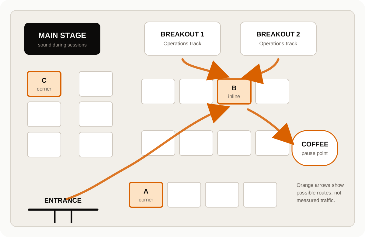
Suppose the booth wants qualified conversations with operations leaders attending the two breakout rooms. Candidate A is a corner near the entrance and looks busiest, candidate B is an inline space on the route from those rooms to coffee, and candidate C is a corner immediately beside the main stage.
The team uses the scoring method above after confirming the agenda and visible obstructions. The figures are documented judgments for this fictional event, not measured performance data.
| Candidate | Target route ×2 | Visibility | Stop | Talk | Schedule | Fit | Value | Total / 24 |
|---|---|---|---|---|---|---|---|---|
| A: entrance corner | 4 | 3 | 2 | 2 | 2 | 3 | 1 | 17 |
| B: breakout-to-coffee inline | 6 | 2 | 3 | 3 | 3 | 2 | 3 | 22 |
| C: stage corner | 6 | 3 | 1 | 0 | 1 | 3 | 1 | 15 |
Candidate B wins because the objective is relevant conversations, not maximum exposure. If the booth instead needed broad brand awareness and had a message readable in seconds, A could become the better choice; if most meetings were booked in advance, the team might reject all three and choose a quieter, cheaper space.
Ask the organizer questions the map cannot answer
Send one concise request covering the unknowns for your shortlist. The organizer may not have every answer, but specific questions are more likely to reveal assumptions before the location is contracted.
- Which entrances will attendees use during show hours?
- Where will registration, session exits, coffee, lunch, and networking take place?
- Will the exhibition remain open while major sessions are running?
- Are any stages, speakers, queues, columns, service areas, or temporary walls missing from this plan?
- Which neighboring spaces are reserved, and can their booth types or height allowances be confirmed?
- Is a previous floor plan, attendee heat map, or comparable event layout available?
- What display and line-of-sight rules apply to this exact booth type?
- What is included in the location price, and what corner or premium charges apply?
- Where will ordered power and wired internet enter the space?
- Can show management move the assigned booth, and what happens if the floor plan changes?
Save the answer with the contract and current floor plan. A screenshot of an online map without its date, legend, and neighboring reservations becomes difficult to interpret after the organizer revises the hall.
Make the decision with three marked-up plans
Shortlist three viable spaces, print or export the current floor plan, and mark target-attendee routes for the event’s important periods. Eliminate physical or operational dealbreakers, score the remaining choices, and sketch the real booth equipment into the top two before paying a premium.
Choose the location whose weaknesses the team can manage. You can adapt a counter position or add a clearer aisle-facing message; you cannot make a loud stage quiet, remove a structural column, or give hurried attendees more time.
Once the booth is assigned, record the hall, zone, booth number, access route, and crew meeting point in the one-page conference booth brief. The location decision is finished only when the team knows how the space will actually be approached and operated.
Next steps
Useful next steps
Resources
One-page conference booth brief
A copy-ready briefing template that aligns a small booth crew on the event goal, visitor message, responsibilities, schedule, and fallback plans.